How to Create Login Page Using HTML and CSS
Welcome to the world of web development, where creating an engaging user interface is as crucial as developing the core functionality of your web applications. One of the first interactions a user has with any web-based platform is often a login page.
This page is not just a gateway to the user’s personal space but also sets the tone for their experience with your application. In this blog post, we’ll embark on a detailed journey to create a login page using HTML and CSS, two of the foundational technologies of web development.
We’ll cover every step from structuring the HTML to adding stylistic flair with CSS, ensuring that even beginners can follow along and craft a functional and visually appealing login page.
Fundamentals of a Login Page
Key Elements of a Login Page
A login page, seemingly simple, performs the critical task of authenticating users. To achieve this, several essential elements must be included:
- Input Fields: Typically, there are two main fields – one for the username or email and another for the password. These fields are the primary interaction points for the user.
- Login Button: Once the user enters their credentials, a login button triggers the authentication process. This button is often styled to stand out, making it clear where to click to proceed.
- Additional Links: Often, you’ll find links for users who have forgotten their password or need to register for a new account. These are usually placed below the login form for easy access.
The Role of a Login Page
The login page is not just about functionality; it’s also about user experience and security:
- First Impression: As the entry point to your application, the login page sets the first impression. A well-designed page can enhance user trust and interest.
- Security: The login page is the first line of defense against unauthorized access. It’s crucial to design it in a way that is secure against common threats.
- User Experience: A user-friendly login page minimizes frustration and makes it easy for users to access their accounts. This includes clear instructions, visible input fields, and responsive design for various devices.
In the following sections, we’ll dive into the technical aspects of creating this integral part of a user’s journey, ensuring clarity in both design and function. Stay tuned as we lay down the HTML structure and bring it to life with CSS styling.
Set Up the HTML Structure
Creating a solid and well-structured HTML foundation is key to building an effective login page. This structure not only organizes the content but also defines the elements that will later be enhanced with CSS.
Let’s break down the steps to set up the HTML structure for our login page.
Start with the HTML5 Boilerplate
Begin with the basic HTML5 template. This template includes essential elements like the DOCTYPE declaration, the <html> tag with a language attribute, the <head> section for metadata, and the <body> tag where our content will reside.
<!DOCTYPE html>
<html lang="en">
<head>
    <meta charset="UTF-8">
    <meta name="viewport" content="width=device-width, initial-scale=1.0">
    <title>Login Page</title>
    <!-- Link to CSS file -->
    <link rel="stylesheet" href="style.css">
</head>
<body>
    <!-- Content goes here -->
</body>
</html>
Create the Login Form Container
Within the <body> tag, the first step is to create a container that will encapsulate the login form. This is typically a <div> element with a class or ID for styling purposes.
<div class="login-container">
    <!-- Login form will be nested here -->
</div>
Structure the Login Form
Inside the login-container div, we insert the actual login form. The <form> tag is used to create this form, encompassing all the necessary fields and the submit button.
<div class="login-container">
    <form class="login-form">
        <!-- Input fields and submit button will go here -->
    </form>
</div>
Add Input Fields and Submit Button
Within the form, add two input fields: one for the username (or email) and the other for the password. Each field is created using the <input> tag, specifying the appropriate type attribute. For the username, type="text" is used, and for the password, type="password". Lastly, include a submit button using <button> or an <input> tag with type="submit".
<form class="login-form">
    <input type="text" id="username" name="username" placeholder="Username" required>
    <input type="password" id="password" name="password" placeholder="Password" required>
    <button type="submit">Login</button>
</form>
Optional Elements: Links for Additional Actions
Optionally, beneath the form, you can add links for users who need to recover their passwords or register for a new account. This is done using the <a> (anchor) tag.
<form class="login-form">
    <!-- Input fields and submit button -->
</form>
<a href="forgot-password.html">Forgot Password?</a>
<a href="register.html">Create an Account</a>
With these steps, the basic HTML structure of your login page is established. It provides a clear and logical layout that will be further styled and brought to life with CSS. The next step in our journey involves diving into the CSS styling to make this login page not just functional but also visually appealing and responsive.
Style the Login Page with CSS
With the HTML structure in place, the next step is to breathe life into our login page using CSS. This section will cover how to style the login container, form, input fields, buttons, and additional links to create an attractive and user-friendly interface.
Basic Styling for the Login Container
Begin by styling the .login-container. The goal is to center the login form on the page both vertically and horizontally. We’ll also add some general styling to define the size and layout.
.login-container {
    display: flex;
    justify-content: center;
    align-items: center;
    height: 100vh; /* Full viewport height */
    background-color: #f0f0f0; /* A light background color */
}
Style the Login Form
The .login-form itself should be distinct and visually appealing. Here, we can add styles for padding, margins, background color, and perhaps a subtle shadow for depth.
.login-form {
    width: 300px; /* Fixed width */
    padding: 20px;
    margin: auto;
    background-color: white;
    box-shadow: 0 2px 4px rgba(0, 0, 0, 0.1);
    border-radius: 5px; /* Rounded corners */
}
Style the Input Fields
Input fields are the primary interaction points and should be styled for clear visibility and ease of use. Consistent height, border styles, and padding are crucial, along with distinct focus styles to guide the user.
.login-form input[type="text"],
.login-form input[type="password"] {
    width: 100%;
    padding: 10px;
    margin: 8px 0;
    display: inline-block;
    border: 1px solid #ccc;
    box-sizing: border-box;
    border-radius: 4px;
}

.login-form input[type="text"]:focus,
.login-form input[type="password"]:focus {
    border-color: #66afe9;
    outline: none;
}
Style the Submit Button
The submit button should be prominent and inviting. We can use color, padding, and typography to make it stand out.
.login-form button {
    width: 100%;
    padding: 10px 20px;
    background-color: #4CAF50; /* A green background */
    color: white;
    border: none;
    border-radius: 4px;
    cursor: pointer;
    font-size: 15px;
}

.login-form button:hover {
    background-color: #45a049; /* A darker shade for hover effect */
}
Style Additional Links
Finally, style any additional links for password recovery or account creation. These should be noticeable but not overpowering, complementing the overall design.
.login-form a {
    display: block;
    margin-top: 12px;
    text-align: center;
    color: #4CAF50;
    text-decoration: none;
}

.login-form a:hover {
    text-decoration: underline;
}
With these CSS styles, your login page will not only function well but also have a professional, clean, and attractive appearance. It’s important to test and tweak these styles to ensure they align with the overall design language of your application and provide a seamless user experience.
Enhance Form Aesthetics
After establishing the basic structure and functionality of the login page, the next step is to enhance the form’s aesthetics. This involves refining the visual elements to create a more engaging and visually pleasing user interface. Let’s delve into advanced CSS techniques that can elevate the design of our login form.
Incorporate Background Images or Colors
A background image or a gradient can add depth and interest to the login form. It’s important to ensure that the text remains legible against the background.
.login-container {
    background-image: url('path-to-background-image.jpg');
    background-size: cover;
    background-position: center;
}

/* For a gradient background */
.login-container {
    background: linear-gradient(to right, #6dd5ed, #2193b0);
}
Advanced Styling for Input Fields
Further refine the input fields with subtle effects like transitions for focus states and elegant borders.
.login-form input[type="text"],
.login-form input[type="password"] {
    transition: border 0.1s ease;
    /* Other styles */
}

.login-form input[type="text"]:focus,
.login-form input[type="password"]:focus {
    border: 2px solid #4CAF50; /* Highlight color */
    box-shadow: 0 0 8px 0 rgba(76, 175, 80, 0.3);
}
Stylish Submit Button
Make the submit button more appealing with hover effects and smoother transitions. Consider using a color that matches or complements the form’s overall palette.
.login-form button {
    transition: background-color 0.1s ease;
    /* Other styles */
}

.login-form button:hover {
    background-color: #367c39; /* A slightly darker green */
    box-shadow: 0 2px 4px rgba(0, 0, 0, 0.2);
}
Animation and Interactivity
Subtle animations can add a layer of interactivity. For instance, animating the login button on hover or focusing on input fields can make the form more engaging.
.login-form button:hover {
    transform: translateY(-2px);
}
By integrating these advanced styling techniques, your login form will not only function efficiently but also stand out with its enhanced aesthetics. Remember, the key is to strike a balance between style and usability, creating a form that is both beautiful and easy to use.
Responsive Design for the Login Page
In today’s digital age, where users access websites from a multitude of devices with varying screen sizes, responsive design is not just an option but a necessity. Ensuring that your login page is responsive means that it will adapt seamlessly to different devices, providing a consistent and user-friendly experience.
Let’s explore the key aspects of making our login page responsive using CSS.
Media Queries
Media queries are the cornerstone of responsive design. They allow us to apply CSS styles based on the viewport size, orientation, and other characteristics of the device. For our login page, we’ll primarily use media queries to adjust layout and font sizes for different screen widths.
Basic Media Query Structure
@media screen and (max-width: 600px) {
    /* Styles for screens narrower than 600px */
}
This is a basic media query where styles inside the block will apply to screens with a width of up to 600 pixels.
Adjust the Login Container for Smaller Screens
On smaller screens, the login container might need adjustments to ensure it doesn’t appear too large or small.
@media screen and (max-width: 600px) {
    .login-container {
        padding: 20px;
        height: auto;
    }
}
In this example, padding is added, and the height is set to auto to ensure the container fits well within smaller screens.
Scale Down the Form Size
The form itself might require resizing to fit comfortably within the viewport of a mobile device.
@media screen and (max-width: 600px) {
    .login-form {
        width: 90%;
        margin: 0 auto;
    }
}
The form’s width is adjusted to 90% of the viewport width, with automatic margins to center it.
Responsive Input Fields and Buttons
Input fields and buttons should be easy to interact with, regardless of the device used. This often means increasing their size for touch-screen usability.
@media screen and (max-width: 600px) {
    .login-form input[type="text"],
    .login-form input[type="password"],
    .login-form button {
        font-size: 16px;
        padding: 15px;
    }
}
Larger font sizes and padding make the elements more touch-friendly.
Font Size Adjustments
For readability, font sizes may need to be adjusted for smaller screens.
@media screen and (max-width: 600px) {
    body {
        font-size: 14px;
    }
}
A smaller font size can sometimes be more suitable for mobile devices.
Test Across Devices
Once these styles are in place, it’s crucial to test the page across various devices and screen sizes. Tools like browser developer tools can simulate different screen sizes for testing. Alternatively, testing on actual devices provides the most accurate representation of user experience.
Responsive design ensures that your login page delivers a consistent and accessible user experience across all devices. By employing media queries and adjusting elements like the container, form, input fields, and font sizes, you can create a login page that not only looks great but also functions seamlessly, regardless of how users access it.
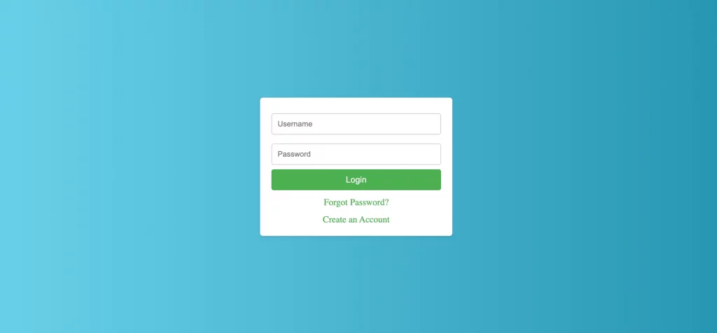
Complete HTML and CSS Code for the Login Page
index.html
<!DOCTYPE html>
<html lang="en">
  <head>
    <meta charset="UTF-8" />
    <meta name="viewport" content="width=device-width, initial-scale=1.0" />
    <title>Login Page</title>
    <link rel="stylesheet" href="style.css" />
  </head>
  <body>
    <div class="login-container">
      <form class="login-form">
        <input
          type="text"
          id="username"
          name="username"
          placeholder="Username"
          required
        />
        <input
          type="password"
          id="password"
          name="password"
          placeholder="Password"
          required
        />
        <button type="submit">Login</button>
        <a href="forgot-password.html">Forgot Password?</a>
        <a href="register.html">Create an Account</a>
      </form>
    </div>
  </body>
</html>
style.css
* {
  margin: 0;
  padding: 0;
}
.login-container {
  display: flex;
  justify-content: center;
  align-items: center;
  height: 100vh; /* Full viewport height */
  background: linear-gradient(to right, #6dd5ed, #2193b0);
}
.login-form {
  width: 300px; /* Fixed width */
  padding: 20px;
  margin: auto;
  background-color: white;
  box-shadow: 0 2px 4px rgba(0, 0, 0, 0.1);
  border-radius: 5px; /* Rounded corners */
}
.login-form input[type="text"],
.login-form input[type="password"] {
    width: 100%;
    padding: 10px;
    margin: 8px 0;
    display: inline-block;
    border: 1px solid #ccc;
    box-sizing: border-box;
    border-radius: 4px;
    transition: border 0.1s ease;
}
.login-form input[type="text"]:focus,
.login-form input[type="password"]:focus {
    border: 2px solid #4CAF50; /* Highlight color */
    box-shadow: 0 0 8px 0 rgba(76, 175, 80, 0.3);
}
.login-form button {
  width: 100%;
  padding: 10px 20px;
  background-color: #4CAF50; /* A green background */
  color: white;
  border: none;
  border-radius: 4px;
  cursor: pointer;
  font-size: 15px;
  transition: background-color 0.1s ease;
}

.login-form button:hover {
  background-color: #367c39; /* A slightly darker green */
    box-shadow: 0 2px 4px rgba(0, 0, 0, 0.2);
    transform: translateY(-2px);
}

.login-form a {
  display: block;
  margin-top: 12px;
  text-align: center;
  color: #4CAF50;
  text-decoration: none;
}

.login-form a:hover {
  text-decoration: underline;
}

@media screen and (max-width: 600px) {
  body {
    font-size: 14px;
}
  .login-container {
      padding: 20px;
      height: auto;
  }
  .login-form {
    width: 90%;
    margin: 0 auto;
}
.login-form input[type="text"],
.login-form input[type="password"],
.login-form button {
    font-size: 16px;
    padding: 15px;
    }
}
And you will get the following output.
Designing an effective login page is a crucial aspect of user interface development, playing a vital role in the overall user experience of any web application. Throughout this guide, we have explored the nuances of creating a login page using HTML and CSS, emphasizing responsive design and user experience.
We started with the basic structure of HTML, laying down the framework of our login page. Then, we moved into the realm of CSS, where we styled and transformed the page into an aesthetically pleasing and functional gateway. The journey took us further into responsive design, ensuring that our login page adapts gracefully across various devices and screen sizes.