HTML Text Animation: Create Dynamic and Engaging Web Content
Looking to spice up your webpage content? Animating your text elements is an easy way to make your pages more engaging and delightful for visitors. With just a bit of HTML and CSS code, you can make words slide, fade, grow, shrink, and move around the page.
In this blog post, we’ll explore some of the most popular text animation effects and how to code them yourself.
Get Started with CSS Animations
Animations in webpages are powered by Cascading Style Sheets (CSS). All text animations involve applying CSS rules that gradually change the appearance of text over time. To animate any element on a page, you need to:
- Define a CSS animation with @keyframes rules
- Attach that animation to text elements with the animation property
This allows you to control exactly how the text looks at each small step of the animation sequence.
Fade Text In and Out
A simple way to add some animation is to make text elements fade in and out. This can be great for callouts, logos, headlines, or other short text you want to highlight.
Here’s an example code snippet:
@keyframes fadeInOut {
  0% {
    opacity: 0;
  }
  50% {
    opacity: 1;
  }
  100% {
    opacity: 0;
  }
}

h1 {
 animation: fadeInOut 5s infinite;
}
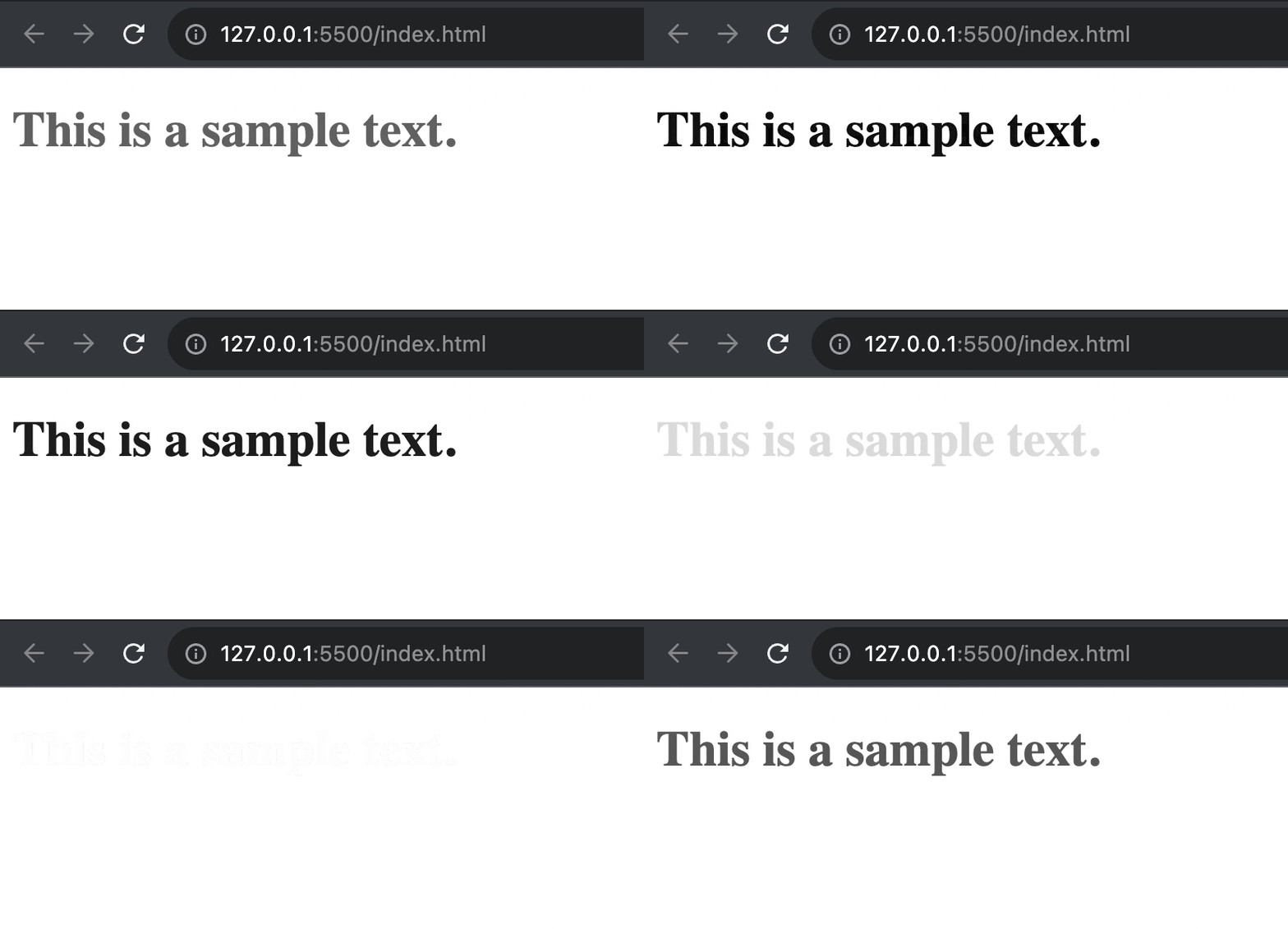
This @keyframes rule handles the opacity changes to make the text transparent at the start and end, fully visible in the middle. Setting it on the element makes that heading text fade in and out forever, creating an eye-catching effect.

Bouncing or Floating Text
For a playful text animation, you can make elements bounce or float around as if they have no gravity. This works well for a short burst of text you want to momentarily distract the viewer.
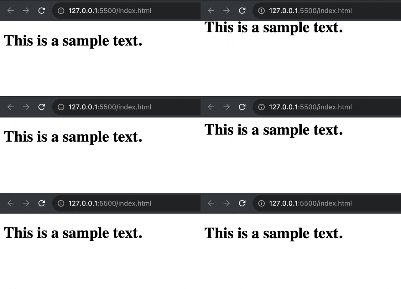
To bounce text, you can animate the vertical position:
@keyframes bounce {
  0%, 20%, 50%, 80%, 100% {transform: translateY(0);}
  40% {transform: translateY(-30px);}
  60% {transform: translateY(-15px);}
}

h1 {
 animation: bounce 5s infinite;
}
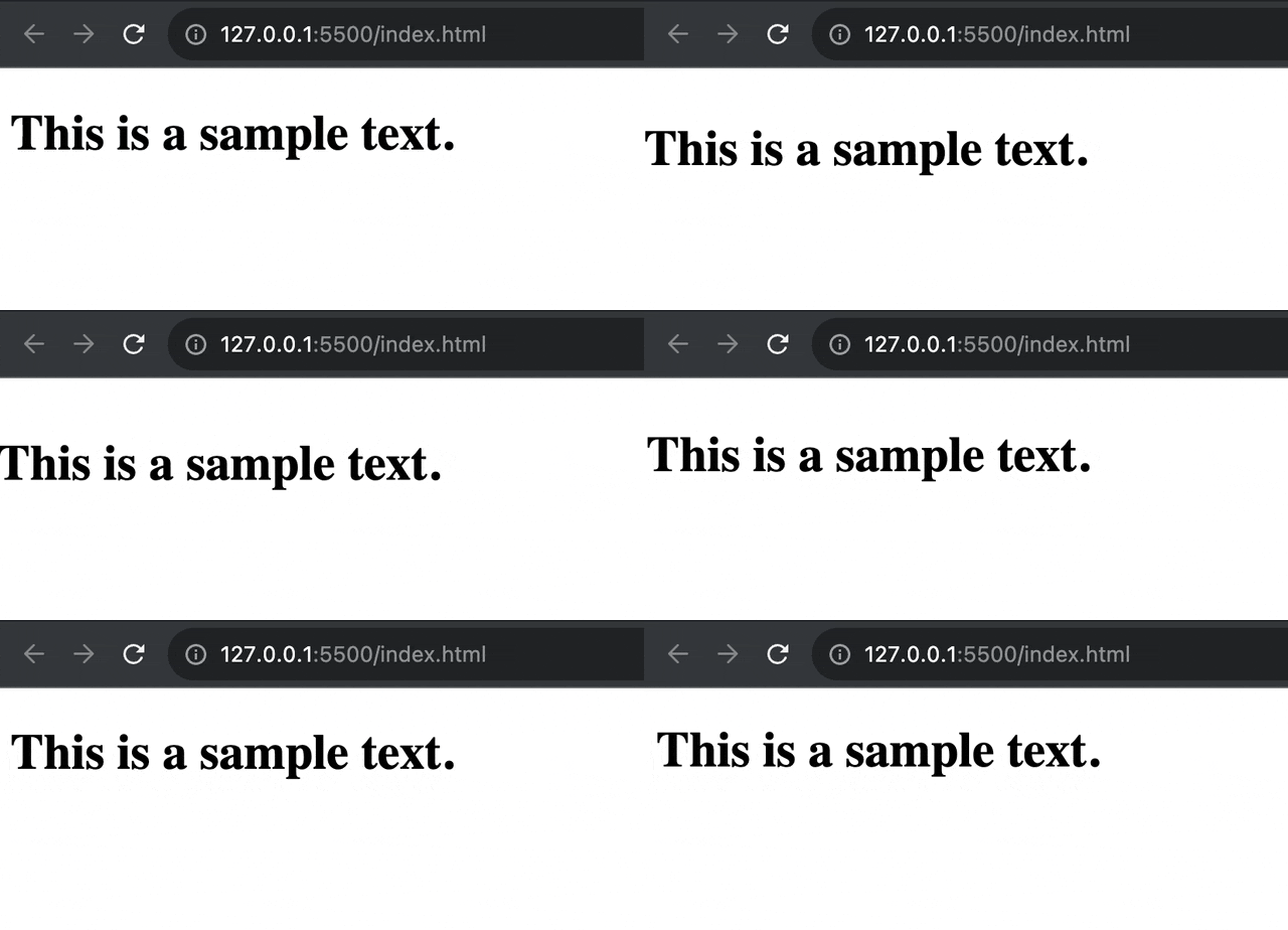
For floating text, just add horizontal movement:
@keyframes float {
  0% {
    transform: translate(0, 0);
  }
  50% {
    transform: translate(-10px, 15px);
  }
  100% {
    transform: translate(0, 0);
  }
}

h1 {
 animation: float 5s infinite;
}
Try out these fun text animation effects on logos, taglines, or pull quotes that you want to grab a viewer’s attention playfully.
These examples just brush the surface of text animations you can build with CSS. You can create typewriter effects, path motions flowing along SVG shapes, 3D flips, and much more. Sky’s the limit for creative text animations to infuse your web content with energy!
The key is starting simple, experimenting with CSS animation properties, and gradually leveling up to more advanced effects. For the deepest control, JavaScript lets you alter animations in response to any user action.
So put your text in motion today! Animations can make reading your content a lively, kinetic experience for site visitors.


