How to Add Text Shadows in HTML
Drop shadows are a stylish way to make text stand out on your web pages. They add depth and can help improve readability when used correctly. In this blog post, we’ll delve into how to create text drop shadows using HTML and CSS, offering a modern touch to your website design.
Text Drop Shadow
A text drop shadow is a visual effect that looks like a shadow behind the text, giving the impression that the text is raised above the background. This effect is achieved using CSS, not directly through HTML.
Use CSS Text-Shadow Property
The Basics of Text-Shadow
The text-shadow property in CSS is used to apply shadow to text. It takes several values:
- Horizontal offset: How far to the right the shadow should be.
- Vertical offset: How far down the shadow should be.
- Blur radius: How blurry or sharp the shadow is.
- Color: The color of the shadow.
Syntax Example:
.shadow-text {
  text-shadow: 2px 2px 4px grey;
}
In your HTML:
<p class="shadow-text">This text has a drop shadow.</p>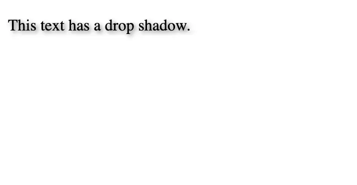
Experiment with Shadow Effects
Create Different Shadow Styles
You can create various effects by changing the text-shadow values:
- Soft Shadow: For a softer shadow, increase the blur radius.
text-shadow: 2px 2px 8px grey;- Bold Shadow: For a bold and prominent shadow, use a larger offset and minimal blur.
text-shadow: 4px 4px 2px black;- Glow Effect: A shadow with a large blur radius and bright color can create a glow effect.
text-shadow: 0 0 10px blue;- Multiple Shadows: You can apply multiple shadows by separating them with commas.
text-shadow: 1px 1px 2px black, 0 0 25px blue, 0 0 5px darkblue;Text drop shadows can be a fantastic addition to your web design toolkit. They add a touch of sophistication and can help text stand out. By following these steps and best practices, you can create visually appealing and accessible web pages with beautifully shadowed text.